


AI Logo Maker & Logo Creator
0.00.00 Reviews
App Specs
- Version
- 1.9
- Updated On
- License
- Free
- Downloads
- 50,000+
- Developer
- Trusted Tools & Utilities Apps
- Categories
- Art & Design
- Platform
- Android
Screenshots
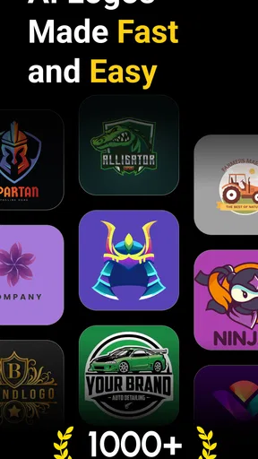
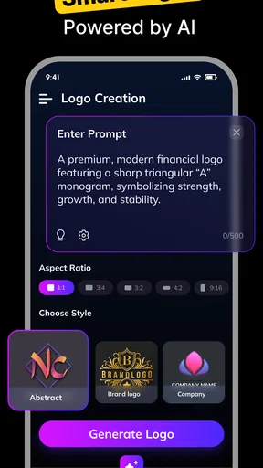
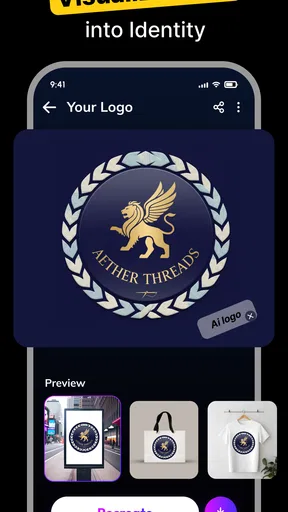
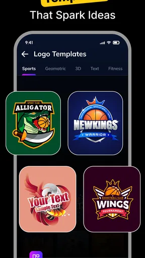
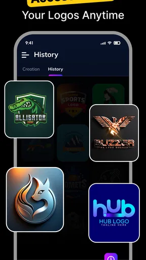
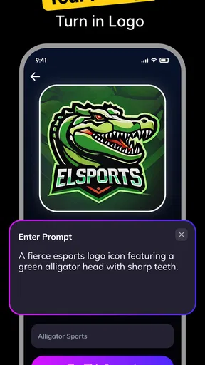
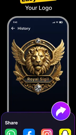
 Analysis by AppCompare
I approached AI Logo Maker & Logo Creator as a quick design tool rather than a full branding studio, and that distinction matters. Its appeal is easy to understand: you want a recognizable logo, you do not want to learn complex design software, and you would rather experiment on a phone than begin with a blank canvas. In my experience, this app is most useful when the goal is a practical first version for a small project, social profile, school activity, personal service, or side business.
The app sits in the Art & Design category and is made by Trusted Tools & Utilities Apps. It is free to install, suitable for Everyone, and supports Android 7.0 or later. The current version is 1.9, while optional in-app purchases range from $0.49 to $33.99 per item. Those details place it firmly in the accessible, mobile-first part of the logo-making market rather than alongside professional desktop suites.
My baseline workflow for creating a usable logo
I found the best way to use this app is to arrive with a simple brief. Before opening the editor, I decide what the logo needs to communicate, where it will appear, and whether the name must remain readable at a small size. That preparation prevents the common mistake of choosing a design merely because it looks attractive in a large preview.
For a first pass, I would enter the name or concept, browse the available starting directions, and select the closest visual idea rather than trying to make the first result perfect. The useful mindset is to treat the initial design as a draft. A logo with a clear shape and ordinary typography often gives me a better foundation than an elaborate option that becomes confusing when reduced.
The app’s AI-focused approach is particularly convenient for people who cannot decide how to begin. Instead of drawing every element manually, I can use generated inspiration to narrow down a visual direction. That saves time at the exploration stage, although it does not remove the need for judgement. Automated suggestions can be visually polished while still feeling too generic for a real identity.
My usual sequence is to choose the concept first, then inspect the lettering, symbol, color relationship, and spacing separately. I avoid changing everything at once. If I alter the font, icon, colors, and arrangement together, I cannot tell which decision improved the result. Working in small steps makes the editor easier to understand and produces a more deliberate outcome.
A realistic everyday example would be a local dog-walking service that needs a profile image before creating a social account. I would start with a simple name treatment and a friendly animal-related direction, then check whether the business name remains legible inside a small square. A detailed illustration may look nice in the editor but lose its identity when used as a small avatar. A bold silhouette and restrained lettering would probably serve the business better.
Worth Reading Before You Choose
EA SPORTS FC Mobile 26 Is a Bigger Football Game, but It Takes Time

Flipboard Shows What News Apps Must Do Beyond the Feed

Switching to Android Auto Means Rethinking Your Driving Routine

Google Calendar Makes a Crowded Week Easier to Manage

Ludo King Makes the Most of the Minutes Between Plans

Baby Panda World Brings Quick Play to Modern Phones, but Its Game Library Feels Busy
That is where this app feels more practical than intimidating design software. I can move from idea to a shareable draft without learning layers, paths, grids, or complex export terminology. For a one-person project, that reduction in friction is valuable. The trade-off is that I have less control than I would expect from a professional vector editor, so the app works best when the desired result is straightforward.
The sharing workflow is another reason it suits quick jobs. Once I am satisfied with a version, I can share it directly instead of treating the design as a long production process. I still recommend keeping a clean master version and checking it in the actual place where it will be used. A logo that looks balanced on a phone screen can appear too cramped in a profile circle or too faint against a different background.
How I judge the first result
I use three quick tests. First, I look at the mark from a distance and ask whether the main shape is still obvious. Second, I hide my emotional reaction to a fashionable color or decorative icon and check whether the name is readable. Third, I imagine seeing it beside other profile images, receipts, packaging, or a simple website header. These tests are more helpful than endlessly browsing attractive templates.
I also make a version with fewer visual elements. This is one of the most useful habits for an AI logo tool because generated designs can encourage over-selection. If the first draft contains a symbol, a badge, several colors, and elaborate lettering, I try removing one element at a time. The simpler version often communicates more clearly, especially for a new business that has not yet built recognition.
For personal projects, I am more willing to keep an expressive design. A podcast cover, gaming identity, craft account, or event logo can tolerate more personality than a service that needs to look trustworthy on an invoice. The app is flexible enough for these different starting points, but the quality of the final decision depends heavily on how carefully I edit the result.
Settings and choices worth checking before sharing
Even in a quick logo maker, the important settings are not only visual. I pay attention to the relationship between the canvas, the text, and the background. If the design is intended for social media, a compact composition is safer. If it is intended for a document or printed sign, the name may need more breathing room. I avoid designing around one destination until I know where the logo will actually appear.
Color deserves a deliberate check. Bright colors can make a generated logo feel energetic, but they may become tiring when used everywhere. I prefer to identify one main color and one supporting tone, then test whether the design still works in a restrained version. This is a useful trade-off: a colorful logo may attract attention in an app preview, while a simpler palette is easier to reuse across posts, invoices, labels, and backgrounds.
Contrast is more important than novelty. I look at the lettering against its immediate background, not just at the overall composition. Thin text, pale colors, and detailed symbols can disappear when the image is compressed or displayed in a small space. If I have to squint to read the name in the editor, I consider that a warning rather than something to fix later.
Typography is another setting where beginners can lose time. I do not choose a font only because it looks distinctive. I check whether the letters remain clear in the actual name, especially if it includes narrow characters, repeated letters, or unusual capitalization. A modest typeface with good spacing can make an automated design feel more credible than a dramatic font that competes with the symbol.
I also inspect alignment and visual weight. A large icon beside small lettering may make the brand name feel secondary. Conversely, a long name beside a tiny symbol can create an awkward empty area. I try to make the symbol and wording support each other instead of allowing one part to dominate by accident.
One practical habit is to prepare two related versions rather than forcing one logo to do everything. I might keep a fuller version for a page header and a simplified version for a profile image. The app is useful for exploring these alternatives quickly, but I would not assume that one generated composition will be equally effective in every format. Adapting the design to its placement is part of the work.
Before sharing, I check the result on both a light and a dark surrounding area when possible. This does not require a complicated branding system; it simply reveals whether the logo depends too heavily on one background. If the mark disappears as soon as the surrounding color changes, I would create a more flexible variation rather than treating the first result as finished.
The free starting point makes experimentation approachable, but users should pay attention when choosing optional items or upgrades. In-app purchases are available, and individual items can cost from $0.49 to $33.99. I would explore the free workflow first and decide whether a paid element genuinely improves the project before committing. For someone needing one simple logo, buying repeatedly can make a supposedly quick task less economical.
Faster patterns that improve repeat work
The fastest users of this kind of app are not necessarily the people who tap the quickest. They are the people who make fewer unfocused decisions. I begin with a short list of words describing the desired mood, audience, and subject. For example, “calm, handmade, local” gives me a more useful direction than simply asking for something beautiful. A clear brief makes the generated options easier to compare.
I also create a small selection of serious candidates instead of saving every interesting result. Too many options create false progress. I usually keep one design that is clear, one that has more personality, and one that is deliberately simple. Then I compare them at the size where the logo will actually be seen. This habit turns browsing into a decision process.
Another useful pattern is to separate exploration from refinement. During exploration, I allow myself to consider different symbols, moods, and layouts. During refinement, I stop changing the concept and focus on readability, balance, and consistency. Mixing those stages makes it easy to keep redesigning forever, especially when the app makes new visual directions easy to try.
For a small business, I would make a checklist before sharing: the name is spelled correctly, the main color is intentional, the symbol is recognizable, the logo works in a square, and the design does not rely on tiny details. This may sound basic, but automated creation encourages people to focus on appearance before checking whether the asset is actually usable.
I would also keep notes about the chosen colors and wording outside the app. That makes it easier to recreate a consistent look in future posts or documents. The logo tool can provide the central mark, but a recognizable identity depends on repeating the same visual decisions elsewhere. This is an important boundary: a logo creator can start a brand system, but it does not replace the discipline of using that system.
For a club or temporary event, the workflow can be even faster. I would choose a strong symbol, make the event name prominent, and avoid spending too much time on a design that may only be used for a short period. For a long-term company, I would slow down and compare the result with competitors, check whether the concept feels too familiar, and consider whether the mark can survive a future redesign.
The app is also a useful communication tool when several people are deciding on a direction. Instead of discussing abstract ideas, I can show a few concrete drafts and ask focused questions: Which one is easiest to recognize? Which name treatment feels most trustworthy? Which version works without the decorative detail? This makes feedback more specific and reduces the chance that the loudest opinion wins simply because it is vague.
Where the app reaches its advanced limits
My main reservation is that an AI logo maker can produce a convincing starting point without guaranteeing a distinctive identity. A generated concept may resemble familiar visual patterns, particularly when it uses common symbols and popular design styles. That does not make it useless, but it means I would treat the result as a practical draft rather than automatically assuming it is unique or strategically strong.
Users who need precise vector construction, detailed path editing, exact spacing rules, custom lettering, or a complete brand guideline will probably outgrow this app. A professional design suite is better when the logo must be adjusted for many sizes, prepared for demanding print work, or refined through exact technical controls. The mobile approach is a strength for speed, but it is also the reason advanced control may feel limited.
I would skip this app if my project depends on an original hand-drawn mark, a complex illustration, or a carefully engineered monogram. In those situations, working with a designer or using a dedicated vector application gives me more control over the parts that make the identity special. I would also look elsewhere if I needed a full collection of coordinated materials rather than a logo-focused starting point.
There is a subtler limitation in relying on a single convenient editor: it can make the first acceptable result feel final. I try to resist that. I compare the generated mark with the actual audience and context, not just with the app’s other options. A logo can be attractive and still be wrong for a serious financial service, too busy for a small stamp, or too ordinary for a creative brand competing for attention.
Export expectations should be realistic as well. I check how the finished image behaves in the destination where I plan to use it, and I avoid promising myself that a mobile preview will solve every production requirement. If the logo is going on merchandise, signage, packaging, or a professional print job, I would confirm that the available output suits the supplier’s needs before paying for production.
The app’s Everyone rating makes it approachable for a broad audience, including students and casual creators. That does not mean every result is equally appropriate for every audience. A child designing a school club emblem may value playful experimentation, while a consultant needs restraint and legibility. The tool can support both, but the user has to apply the right standard.
Who will get the most from it
I would recommend it to someone launching a small service, testing a business idea, creating a personal project, or needing a quick visual identity without design experience. It is especially helpful when the immediate goal is to move from an empty page to several usable directions. The low barrier matters more here than advanced precision.
It is also a good fit for people who work primarily from a phone. If I need to develop a concept while commuting, between appointments, or away from a computer, a mobile logo workflow is more realistic than opening a large desktop application. The app’s free entry point makes it easier to test that workflow before deciding whether it belongs in a regular creative process.
I would be more cautious about recommending it as the final tool for an established company. A business with an existing identity may need careful adaptation rather than a new generated mark. In that case, a professional designer or a more controllable editor is likely the better choice. The app can still help with rough concepts, but I would not use convenience as a substitute for brand strategy.
The developer, Trusted Tools & Utilities Apps, positions the product within a broad utility-minded approach, and that matches my experience of it: it is designed to help complete a focused task quickly. I do not see it as a replacement for learning design fundamentals. I see it as a way to apply a few fundamentals—contrast, hierarchy, simplicity, and context—without needing a large toolkit.
Its scale is also modest, with over 50 thousand installs, so I would judge it by the usefulness of the workflow rather than by assuming it has the depth of a long-established professional platform. That is not a criticism by itself. For a narrowly defined task, a smaller tool can be preferable if it gets me to a workable result with less setup.
My verdict after using the workflow
The real strength of AI Logo Maker & Logo Creator is speed with a low learning curve. It gives beginners a practical way to explore logo directions, refine a promising draft, and share something presentable without starting in a complicated design environment. I especially like it for temporary projects, small businesses, social profiles, and early-stage ideas where a usable first identity matters more than perfect technical control.
My recommendation comes with a clear condition: do not stop at the first attractive result. Write a brief, compare a small number of candidates, test the design at its real display size, simplify crowded compositions, and check contrast before sharing. Those habits make a much bigger difference than endlessly generating new options.
The app is free to begin, carries an Everyone age rating, and runs on Android 7.0 or later, which keeps it accessible to many users. Optional purchases mean I would remain attentive during the editing process and avoid paying for extras before understanding their value. For a quick logo, the free experience may be enough; for a long-term brand, I would budget time and possibly professional help as well as money.
In the end, I would recommend this app to a friend who says, “I need a decent logo today, but I am not a designer.” I would not recommend it to someone who needs a technically exact, highly original identity prepared for every professional application. Used within its proper limits, it is a convenient creative starting point—and with a repeatable workflow, it can produce a result that feels considered rather than merely generated.
Pros
- Creates polished logo concepts quickly with minimal design experience.
- Offers many templates
- icons
- fonts
- and color combinations to explore.
- Useful for testing several brand directions before hiring a designer.
- Simple editing tools make resizing and repositioning elements straightforward.
- Suitable for small businesses
- creators
- clubs
- and personal projects.
Cons
- Some of the best templates and assets may require a paid subscription.
- AI-generated designs can look similar to logos made by other users.
- Advanced branding controls may be limited compared with professional design software.
- Export options and file formats may depend on the selected plan.
- Results often need manual refinement to achieve a truly distinctive identity.
FAQs for AI Logo Maker & Logo Creator
What is AI Logo Maker & Logo Creator, and how does it work?
AI Logo Maker & Logo Creator is a design app that helps you create branding graphics without requiring professional design experience. After entering a business name, choosing an industry, and selecting a preferred style, the app generates logo concepts or lets you build one manually with icons, fonts, colors, shapes, and layout tools. You can then adjust the result until it matches your brand’s overall look.
Can I create a professional logo without any design skills?
Yes. The app is aimed primarily at beginners, small businesses, content creators, and anyone who needs a logo quickly. Its templates, suggested combinations, and AI-powered concepts provide a useful starting point, while the editing tools allow you to change colors, typography, spacing, and symbols. However, the final quality depends on your choices, and some projects may still need manual refinement.
Are the logos created with AI Logo Maker & Logo Creator free to download and use?
The app may allow you to design logos at no initial cost, but certain features, premium templates, high-resolution exports, or file formats can require a subscription or one-time purchase. Before downloading a finished logo, carefully review the pricing screen and export conditions. You should also check the app’s current licensing terms to understand whether commercial use is permitted.
What file formats and image quality can I expect when exporting a logo?
Export options depend on the version of the app and the plan associated with your account. Many logo-making apps provide standard image exports such as PNG or JPG, while transparent backgrounds, larger dimensions, or editable files may be restricted to premium users. If you need a logo for printing, signage, or professional branding, verify the available resolution and format before completing your design.
Is AI Logo Maker & Logo Creator suitable for business branding and commercial projects?
It can be useful for creating a quick logo for a new business, online shop, social media profile, YouTube channel, or personal project. Nevertheless, you should review the ownership and usage rights for every template, icon, font, and AI-generated element included in your design. Similar logos may also be created by other users, so a professional designer may be preferable when uniqueness and trademark protection are important.


